Art Thread

Though I’m not going to tell Mike what Link ought to look like for anything he draws, I wanted to talk about where he came from.

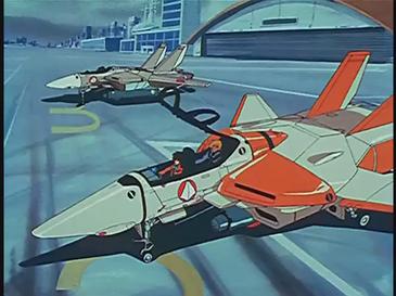
The Brave series was a toy-and-anime line created by Takara and Sunrise, following the Transformers franchise (probably much more familiar to American audiences). It consisted of eight shows and some spin-offs: Brave Exkaiser, Fighbird, Da-Garn, Brave Express Might Gaine, Brave Police J-Decker, Brave of Gold Goldran, Brave Command Dagwon, and GaoGaiGar. A couple of the shows took shots at themselves or their franchise, like Fighbird’s light-hearted heroics and Might Gaine’s overt attack on the “toyetic” nature of the franchise, but it was still all in good fun.

All shows had a few key threads of narrative: “good” vs. “bad” energy, human-robot relations, responsibility to planet Earth, a team of heroes working together. Many included specific common elements like energy beings of a “space police force”. Roles in each show were shuffled around: the Hero, the Kid, the Main Robot, the Support. Half the time, the Hero and the Main Robot were the same person, for example. The importance of the Kid fluctuated, from being the one to give orders to the robots (Da-Garn), to tag-along sidekick (Fighbird) to vital plot element (GaoGaiGar).

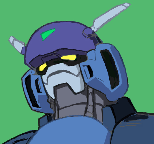
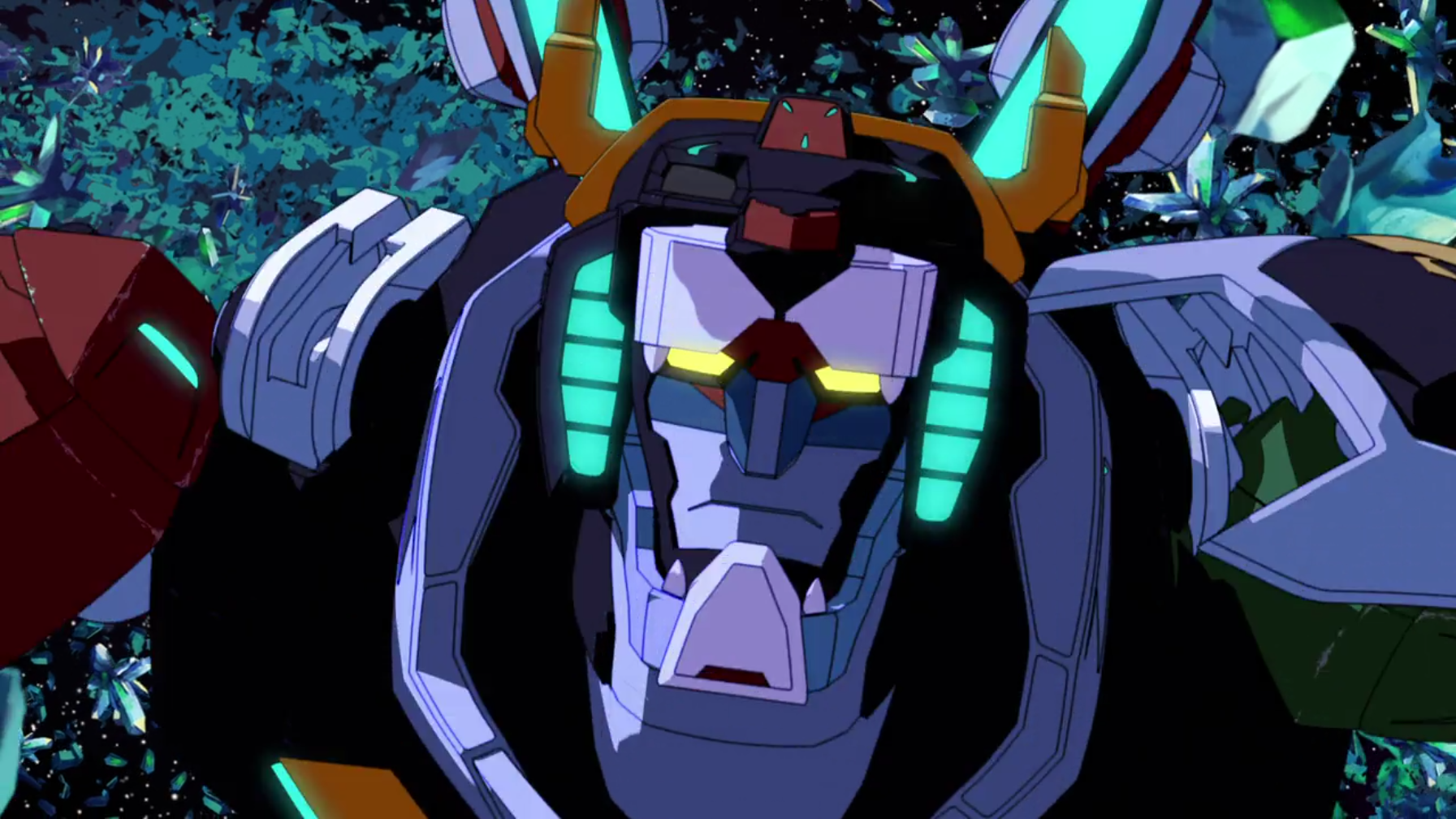
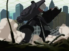
A long-time fan of anime relayed to me some basic wisdom: “people in the shows with superpowers are basically samurai, ronin, or ninja”. Virtually all mecha designs follow this rule, specifically presenting the giant robots as elaborate metal samurai. The heads in particular, with their fins, wings, mouth guards (on a robot!), and so on, call to mind the kabuto of Japan. Animal motifs - lions, birds, even dinosaurs - featured prominently.

Mobile Suit Gundam’s color palette (strong primary colors, red/white/blue for the hero robot, black and gold highlights) carried through to the Brave series’ robots, and to their human protagonists as well. Here’s a gallery of the lead characters in each show:

So yeah.

You’ve already seen Dagwon’s En Daidouji - I’m using him as Link’s avatar.

Of course, there’s some overlap with the live-action tokusatsu genre, where the “Ranger” characters wear their colors in civilian mode. Aside from letting younger viewers immediately recognize a character, the colors themselves have associations. Red is strength, passion, and self-sacrifice, so these are typically assigned to these leading characters.

Sunrise played around with the art style in each series. Though the mecha were often very similar, the human characters went from highly stylized to reasonably well-drawn (particularly in Dagwon, where “pretty boy” appeal was offered to draw in female viewers, similar to Mobile Suit Gundam Wing). You could watch any of the shows and tell immediately who was the main character by this common palette.

I chose white instead of red to avoid too many comparisons with Iron Man (and let’s face it, Spider-man) when Link is in his armor. Still, Leo (the Lion) Snow (the bastard son of a Stark - in this case, Tony) is meant to come from this line of red-jacketed, big-haired fighters for justice.

author: Bill G.
url: Community Forums: Art Thread | Roll20: Online virtual tabletop

More random stuff here: https://app.roll20.net/forum/post/5411885/visual-r…

What about Pneuma then? Whether or not she ever gets art, she looks like something. I think Doyce had some art that caught his eye, but I can’t find the post immediately. I had a different, and specific inspiration. Both of us are probably wrong :slight_smile: But why?

After their argument about Pneuma’s intended role in his life, Leo chose to commit to what she wanted - independence. He gave her access to all his robotics equipment and shut the lab door. She had - and still has - total authority over what she looks like, including height, build, coloration, and so on. And she can change it, if she wants. That’s part of the deal.

author: Bill G.
url: Community Forums: Art Thread | Roll20: Online virtual tabletop

I posted a couple pictures of my head-canon pneuma during the last game. Sort of combat-mode and civilian-mode.

If I wanted to tie it into what Bill already posted, my head-canon would include the explanation that she’s slowly changing her look to reflect the native heritage in the area where Halcyon City is located, but basically I just liked the body armor that’s actually just body (though the armor would be white, or mostly white), and the thoughtful golden eyes on the civilian picture. The two faces don’t actually look at all the same, but the palette is similar?

Again, this is just my head-canon. I see her switch to combat mode by literally flipping her “body-panels” or something, but that’s just me.

Unlike the other two, this isn’t from Bill’s pinterest board, but I like the face. It ignores everything I just said.

author: Doyce T.
url: https://app.roll20.net/forum/permalink/5562174

I like that last one. My own head-canon has been more like the Maria 'bot in Metropolis, but I don’t at all assert it’s good head-canon.

author: *** Dave H.
url: Community Forums: Art Thread | Roll20: Online virtual tabletop

Doyce T. said:

Unlike the other two, this isn’t from Bill’s pinterest board

It is now. https://www.pinterest.com/pin/422001427575910165/

author: Bill G.
url: https://app.roll20.net/forum/permalink/5563223

:slight_smile:

author: Doyce T.
url: https://app.roll20.net/forum/permalink/5564569

Just don’t go for the Japanese look. Amir kept setting this up as Jason’s wallpaper on various devices. And that so doesn’t look like his corgi.

author: *** Dave H.
url: https://app.roll20.net/forum/permalink/5564984

On the note of hexagonal nanotech, I found this:

https://www.pinterest.com/pin/444026844495748702/

author: Bill G.
url: Community Forums: Art Thread | Roll20: Online virtual tabletop

Finally getting around to trying something for Link (I really don’t like doing highly technical things, so I’ve been putting it off) and I was overly amused with if I played with the colors they sort of look like different members of a sentai/Power Rangers team.

The helmet is based a bit off one of Bill’s references and the Aegis armor from Mass Effect 2 (my second favorite helmet design from that series). Based on Bill’s description, I wanted something equal parts Iron Man and Power Rangers. I don’t think this is anything close to what the finished design is going to look like, but I do think it’s a good jump off point to start discussing things.

A few more interesting details that I gathered from all this: the major color shared by the majority of the team is white. It’s a dominant color in Link, Concord, and Mercury’s design (if you count silver as white). Based on my initial design, Ghost Girl also has white as an accent color. That just leaves Jason out with his primary color being black (diametrically opposed to white) which sort of fits the team dynamic going on.

Now I want that major moment when Jason gets on the same page as the rest of the team to involve a costume change to something white. Or he could just Renegade option it (more Mass Effect references!*) and get everyone else to fall into line with him, making the color shift happen to the rest of the team.

*Link not relevant to anything, I just love that exchange from ME2.

author: Mike
url: Community Forums: Art Thread | Roll20: Online virtual tabletop

Did some thinking about this!

On the one hand, if you don’t like doing tech-focused art, I literally have a Pinterest board full of armor candidates in case I need a visual reference, and I’d love to see what you make of unsuited Leo or Pneuma. On the other hand, every artist I know likes to challenge themselves sooner or later, and I don’t know where you are in that process, but I like what you did so far.

What you have here reminds me of Pacific Rim’s Gipsy Danger suits (https://www.pinterest.com/pin/422001427575355977/). Without seeing anything below the shoulders, I don’t know where what you have falls on the scale between “flexible pilot suit” and “solid plate armor”. By design, the Link Suit would be closer to “solid plate”. Suits like this (https://www.pinterest.com/pin/422001427575361078/) look more flexible, but ones like this (https://www.pinterest.com/pin/422001427575489790/) follow the contours of a human body but still look reasonably solid.

From a visual perspective, I think the most important thing is the face. In a TV show or movie, the helmet needs to either show the actor’s face so they can emote, or project a strong impression by itself. The bad-guy mooks will either be faceless, or have something that’s not recognizably a face (https://i.pinimg.com/736x/ea/e0/a5/eae0a5cbb9980b2…). Leo won’t show his face - he still has a secret identity at this point. So his helmet needs to emote for him.

The archetypical mecha helmet has a sloped top, forming a thick brow over the eyes to give a stern impression. A mouth guard or mask effect hides the highly expressive lips of a human face. An example here: https://orig00.deviantart.net/3819/f/2009/105/3/9…

Voltron looks more like a samurai warrior in a lion helmet, but with a similarly stern facial impression: https://vignette2.wikia.nocookie.net/voltron/image…

So what does Link want to emote? He’s dangerous, he can see you, he’s coming for you. A visor-like line of light (https://www.pinterest.com/pin/422001427575676056/), optionally with something eye-like (https://www.pinterest.com/pin/422001427575360498/), might serve better than a solid plate. My intuition is that wider optics will look like bigger eyes on regular characters, conveying youth or immaturity (and Leo’s certainly still that). Having the Tron lines extend up to the helmet let you sculpt a facial expression, give the impression of a mouth, and so on.

author: Bill G.
url: Community Forums: Art Thread | Roll20: Online virtual tabletop

Yeah, Link out of armor is pretty simple. I have a really clear image in mind for him in civies (I don’t want to deviate very far from the look in your various Leo Meets the Internet comics. That’s canon as far as I’m concerned.) but armor’s a whole other story. I do appreciate all the thought you’ve put into this, reference material is always awesome.

Here’s something I sketched out this evening.

Still playing around with the overall look. The contours are completely off, but I do want to use this as an example piece.

Gypsy Danger’s drift suits were totally an inspiration for those. I’d sent it one of your old posts and threw it into my reference folder.

You’re definitely right, the face plate is important. I want to stay away from the Iron Man look, but it is so human looking. Voltron would be cool to style after, but I’d really need to redesign the helmet shape. Funny enough, my first thought was Matt LeBlanc’s helmet from the Lost in Space movie. (As a movie, it’s pretty bad. As something cool to turn on and look as nice SFX and designs, it’s pretty good.)

In a completely other direction, my original plan with the faceless helmet with the full face glass covering would be hard to put on and take off and instead it would just lighten up on the inside (like the divesuits in the Abyss) if Leo wanted to show someone his face for some reason. A bit oddball, but it seems like something Leo wouldn’t think of at first and then when it did come up, his first thought might be “oh that’s an easy fix” instead of “let’s redesign the helmet from the ground up”.

So, those light up triangles. What are they? In my mind, they’re the hardpoints that Link’s grapple lines fire out from. I need to reorient them a little. The ones on the hips I see working like the Big O’s hooks and as for the ones on the shoulders… I’m of two minds at the moment. I’m beginning to think about basing them on various shoulder rocket designs, but part of me thinks that’s silly and that they’re probably just upward mounted on his shoulder blades and probably not visible from the front. For the ones on the wrists, I just need to re-contour the wrist mount so that they make more sense.

As I’m writing this and reviewing your various links, I am really starting to dig this design. I might use it as a base, but I think I’m going to have to start thinking about accent color too. The white main color is fine and fits Leo’s character, but it looks a little bland without something to accent it with (and I don’t want to use black or the metal colors as accents, as they sort of just blend into the lineart). I’m half tempted to use a rust red or orange as a little shout out to Leo’s junkyard workshop, but I also wondered if you had any ideas on that front.

Probably next time I’ll throw in some designs for the rest of Leo’s crew. Pneuma is going to be interesting.

author: Mike
url: Community Forums: Art Thread | Roll20: Online virtual tabletop

OMG I FORGOT ABOUT BIG O I LOVED THAT SHOW.

author: Doyce T.
url: https://app.roll20.net/forum/permalink/5613968

Doyce T. said:

OMG I FORGOT ABOUT BIG O I LOVED THAT SHOW.

Oh? You forgot about a show featuring a guy who tries to talk to his enemies, hangs around with a robot girl, drives a big robot, and is on the wrong side of the police much of the time?

Because I didn’t. :smiley:

author: Bill G.
url: Community Forums: Art Thread | Roll20: Online virtual tabletop

Touche, Bill.

Also after posting this I thought to myself, “you know, in the time it took you to render out that sketch, you probably could have roughed out like four or five other designs and iterated closer to something you like.” Man I hate being inconsistent.

author: Mike
url: https://app.roll20.net/forum/permalink/5614027

Mike said:

Here’s something I sketched out this evening.

He looks like he’s having a rough day, so it’s spot-on. :slight_smile:

I think what Iron Man lacks is that sort of framing helmet-type effect. Putting a ‘face’ on the suit without that would probably look too close, yeah. I do remember the Lost in Space helmet too! It struck me as a curiously medieval aesthetic, which was awesome. Collapsible Helmets are of course done in a lot of places. It didn’t feel right for this particular character yet, though as he develops and opens up more, he’d adopt something like that. So mark that down as a milestone of character development.

Skyhooks: I imagined them as relatively small for what they do. Placement-wise, circular turrets on the hips and shoulders, flush with the armor when not in use, and able to rotate 360 degrees and fire at an angle as needed. Their positioning is pragmatic - they need to be mounted where the armor is most rigid, since they’ll be load-bearing. They should definitely be able to fire at all angles, like Big O’s restraint system, and for the same reason.

I agree that the last link in your post looks solid - I’ve been collecting many more along those lines since I first saw it. What other colors to include? The classic answer to this question works fine for me. Aside from that, part of the conceit of Leo’s junkyard is that a lot of Halcyon City’s wrecked tech ends up there, and that he built some of his stuff using that. The colors I associate with super-prototype or trainer vehicles like that would be bright orange or yellow-gold, like the Valkyrie in the foreground here. Visually treating the armor like a prototype of its own is certainly appropriate. :slight_smile:

Everything you’re doing, for all the PCs, is awesome and I’m grateful for the time you’ve put into it so far.

author: Bill G.
url: https://app.roll20.net/forum/permalink/5614109

Apropos of nearly nothing …

Funny enough, my first thought was Matt LeBlanc’s helmet from the Lost in Space movie. (As a movie, it’s pretty bad. As something cool to turn on and look as nice SFX and designs, it’s pretty good.

I have such a love-hate relationship with that movie. On the one hand, there are some visuals and ideas they use that are absolutely top-notch. And I always appreciate cameos for previous role-players in a movie remake.

On the other hand, the plot is horrifyingly written by an internally conflicted committee of idiots.

Bottom line, I actually based a character (in Doyce’ oft-referenced ADRPG campaign) on Gary Oldman’s Doctor Smith (Edward, Assassin of Amber). So I am horribly prejudiced.

Also, yes, Matt Leblanc’s armor helmet thang was very cool.

Dammit. Now I need to watch that movie again. And I always feel dirty when I do.

author: *** Dave H.
url: https://app.roll20.net/forum/permalink/5614268

For collapsible or otherwise easy-access helmets, one option is the Robocop 2014 flip-down helmet. It’s got the light-line optics, plus the half-exposed face typical of many superhero masks and toku helmets. Tough to depict in a static image, but I’ll keep it in mind as a feature.

author: Bill G.
url: Community Forums: Art Thread | Roll20: Online virtual tabletop

*** Dave H. said:

I have such a love-hate relationship with that movie. On the one hand, there are some visuals and ideas they use that are absolutely top-notch. And I always appreciate cameos for previous role-players in a movie remake.

Oh Dave, you would not believe the number of movies, documentaries, tv shows, music videos, and books that I own that I don’t really care about but keep around because of good visuals.

author: Mike
url: https://app.roll20.net/forum/permalink/5615198

Mike said:

“you know, in the time it took you to render out that sketch, you probably could have roughed out like four or five other designs and iterated closer to something you like.” Man I hate being inconsistent.

So yeah, I was totally right about iterative design.

Started with just throwing whatever I could think of on the canvas (in hindsight, 5 is totally Robo-Thor) but towards the end I suddenly thought about why Bill had said Link chose white as the primary color. This led me to thought line of “Hmm, Leo wants to be a hero, a proverbial white knight… wait, why don’t we make him a white knight?” There was also a bit where I started playing around with the design trying to make a “best of” all the previous designs, which would be #9 and #12. And that was where I really wanted to stick with the helmet visor look.

On that same note, if we do go with the White Knight design, I vote that we make Troll Link’s nemesis who constantly tries to pull him to the dark side. There’s some puns waiting to happen there.

#7 would make an awesome villain look. #1 would be the skull design for his robot minions.

The figure is me just playing around seeing if I liked a bulkier design like Bunker from the Sentinels of the Multiverse. (A great card game, by the way. I play it on Steam with my friends all the time. Would not recommend the physical version though, there’s a lot of things to keep in mind basically all the time and I’d rather offload that mental work to a computer.) I like the shoulder hooks a lot the more I think about them, and making some knightly pauldrons would give somewhere to hide them.

author: Mike
url: Community Forums: Art Thread | Roll20: Online virtual tabletop

Neither Link nor I can take Troll seriously at all though. I’ve kind of got an arch villain as well. :slight_smile:

author: Bill G.
url: https://app.roll20.net/forum/permalink/5616814