Bill G. said:
I dunno what Margie has in mind, but for Ghost Girl, it feels to me like one living and one dead acquaintance - with GG literally and metaphorically in the middle, bridging the two - is as good a symbol for her as a character as anything else.
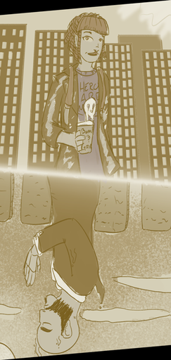
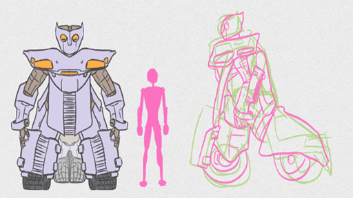
I really liked that idea, so I drew out a rough to see how it’d work. I’m going to need to play with the shape, duality, seperation and the color values (basically everything, but I didn’t expect much out of “see what you come up with in fifteen minutes”), but I still like it. BTW, I have no idea who the guy on the bottom is, I just was using him as a stand in for a ghostly figure. My second thought is to have a ghostly/lively procession following behind the main figures, but we’ll have to see how that’ll look with the narrow size constraints.
Margie K. said:
I like the idea of PP since everyone is so taken by her. The other side my take iconagraphy from the graveyard, like her gravestone. I worry that it will take some effort to make sure the dead friend looks dead but not creepy
I could try an object instead of a person as the main figure on the bottom… I’m going to want to play around with that idea too. Ugh, I really need to tear through all of your image threads again for ideas.
*** Dave H. said:
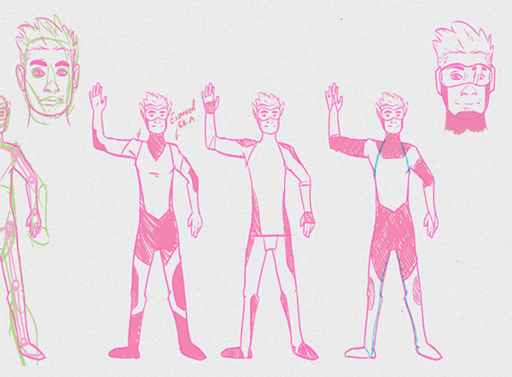
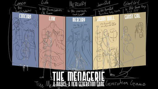
For Jason, the four background head selections are perfect (the only other one I could think of at this point is Amir, but we haven’t really brought him into the game (as of yet)); I agree that Barbara and Hannah don’t fit here (so far as we know) as important characters (Rusty’s importance, to date, has been more background assumption than anything else. I need to write up a flashback for that.).
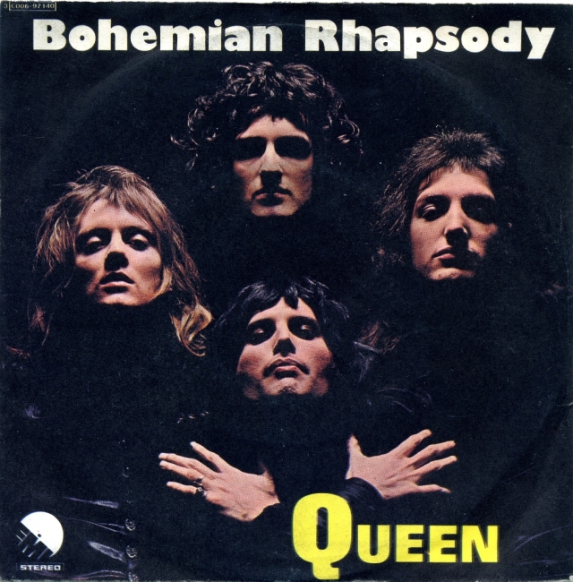
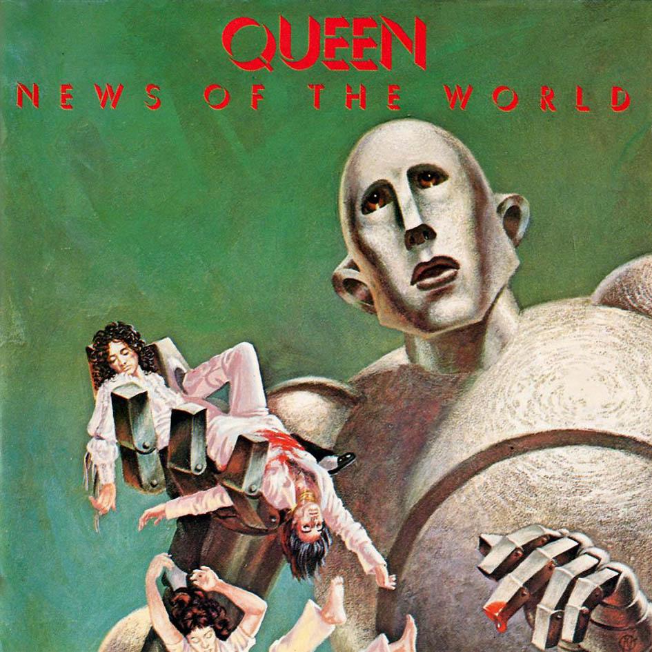
Assuming you’re thinking a cross between the “Bohemian Rhapsody” single cover and (in alignment) “Hot Space” (hopefully not a “News of the World,” though that’s appropriately comic-booky, or at least pulp). Having the first three in more death mask (or just eyes closed) / shadowed, but Alycia giving me the eye (accusingly? angrily? uncertainly? yes!) is nice.
Part of me thinks Alycia should be upper right; I understand wanting to juxtapose Byron and Achilles across the top, but Alycia being on the bottom row seems to underplay her.
(Alternately, as I’ve written the above, maybe go for the BR album cover “diamond” – Alycia at the top, Byron and Achilles viewer left and right, Rusty (if there’s space to fit him) bottom.)
I really like the BR diamond, but there’s a small issue… Jason’s body is going to block someone. It’s kind of an issue with everyone that I’m going to try and work around. My initial thought is have the diamond be Alycia on top, Rusty and Byron in the middle, and Dr. Chin on the bottom, and then position Jason’s pose so it mostly obscures Rusty, but it isn’t going to be a perfect solution since he’ll also obscure the Chins. I think I’m just going to need to do some tests and see how they come out. The back panels are definitely not supposed to be the focus, so I guess I shouldn’t worry about them too much. More to come on that front.
*** Dave H. said:
In the legend at the bottom, I’d recommend having the initial (left-hand) “A” be either lower case (if the font supports it) or superscripted, so that it’s not “A Masks: A New Generation Game” which didn’t parse well when I first looked at it. Alternately, if there’s some way to shift the color between “A … Game” and “Masks: A New Generation,” that might help (or italics/oblique type, or underling, or something). Does that make sense?
I really didn’t like it when I wrote it for all of the reasons you mentioned, but I couldn’t think of a good way to deal with it. I’ll see if the font I used has an italicized version (I know it doesn’t have low-case script). I might just switch to another font that does if I can’t think of something better (I’m iffy about trying the color shift. It’ll draw the viewer’s eye unless it is subtle and that isn’t really the intent.)
*** Dave H. said:
Okay, that’s enough unsolicited advice. Again triffic stuff here, eager to see it develop.
No, no. Totally solicited. Continue advice as it comes to you.
author: Mike
url: https://app.roll20.net/forum/permalink/5689116