What I meant was, all the public High Schools (South, North, Central, West, Shoreline, et cetera) do the variations on a theme?
I had forgotten the various version of the public high school (and don’t recall which one “our” Halcyon High is). I’ll leave that to the enrollees there.
Continuing work on the collage (probably the right word for this mess of imagery) and needed some ideas for a couple of things. Thought some of you might like helping source some inspiration for things:
Gardner Academy seems like at least a dress code (if not full on school uniforms) institution. Any ideas?
With the challenges of “costumes” for the metas in the group (though it’s considered declasse to wear them on campus unless they are specifically life-supporting, military, etc.) a dress code would be tricky. We’ll say something nice – collared shirts, no holes in the pants, skirts in the fingertips+3" range. There’s probably a certain social pressure (and counter-pressure) within the student body about it.
AEGIS Agents: strictly men in black or do they have a field uniform
A compromise between the Men in Black and SHIELD: conservative suit-and-tie for normal activities, but standard battle togs for active security situations.
Similar question for Quill Industries: Silicon Valley-style work casual attire or there some sort of branding involved?
More disciplined than Silly Valley -- denim discouraged, collared shirts (again), managers wear ties but only when meeting with clients. There are a fair number of old-school engineering types that prefer the slacks+white short-sleeved dress shirt model, but they're mostly senior discipline leads, with the younger arrives preferring something a bit less NASA. There are a number of folk wearing Quill-branded clothes, but only because they are used for a number of internal promotions and prizes.
What I meant was, all the public High Schools (South, North, Central, West, Shoreline, et cetera) do the variations on a theme?
I had forgotten the various version of the public high school (and don’t recall which one “our” Halcyon High is). I’ll leave that to the enrollees there.
[I hate the way control-z acts on the forums.]
Leo and Adam are at Halcyon High South, though as we’ve mentioned that name is misleading; South is functionally ‘central’ these days, relative to the whole city. With the shoreline of the bay to the north, the only way to grow was the other directions, which has left HHSouth almost directly at the center of today’s greater Halcyon City metropolitan area.
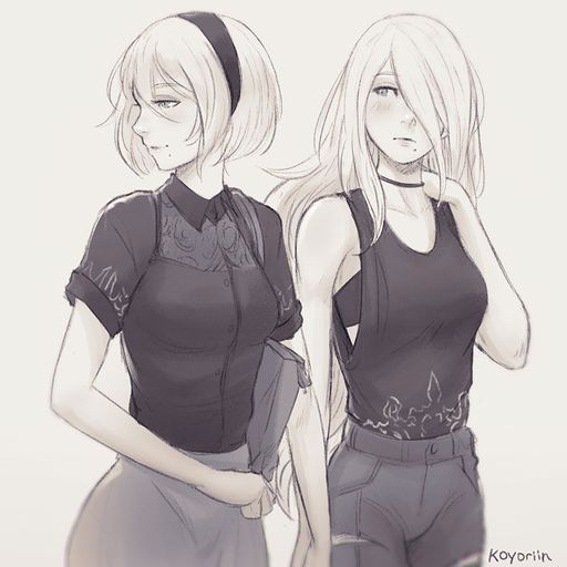
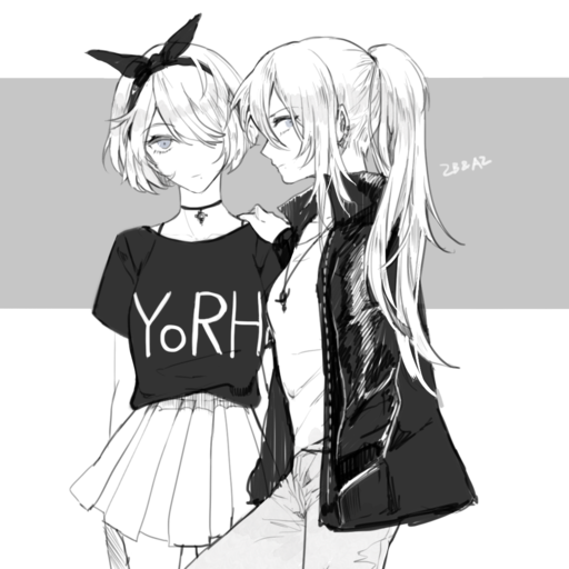
I did some digging for relevant pics for Pneuma/Numina from where I think Mike started. Here’s 2B (short hair, band) and A2 (long hair), the white-haired gynoids of Nier: Automata, outside of their usual (and very distinctive) costumes.
I talked a couple times about Pneuma’s future job choices, and “flying brick superhero” and “lawyer/politician for local issues” were two options. But there was a third one, a super-spy/infiltrator/secret agent type. Somebody’s OC posted today looked very much like I pictured that. Links rather than inline image because the character is a little more grown up.
Okay guys, time for something a little different. Figured I would channel our collective creative talents into something. And what exactly are we good at creatively? Why graffiti’ing backgrounds, of course.
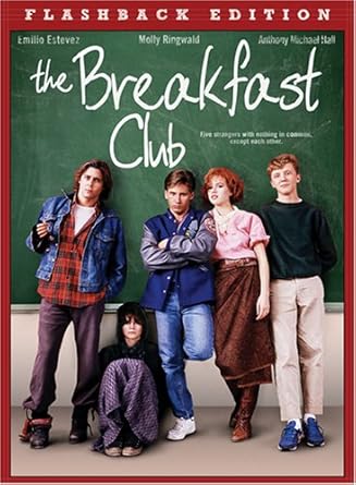
So I sketched out a picture (Standard disclaimer: This is early sketchy stages. I’m still cleaning things up.) and since I was basing this on the cover of the Breakfast Club that there was a chalkboard in the background and that needed some standard chalkboard doodles and other crazy stuff written on it.
“But wait,” I thought, “we do this all the time during the game. I bet everyone would love for the opportunity to do something similar.”
So, I present you with this. Not really going to moderate this at all, I just ask not to get too bawdy and keep everything fun. I’ll check back in a couple of days and see what you guys come up with.
Yeah, I need to fix that. Went too far with “he tiny.” He should be about a foot or so shorter than everyone else. It doesn’t help that he’s next to Link “my power suit makes me huge.”
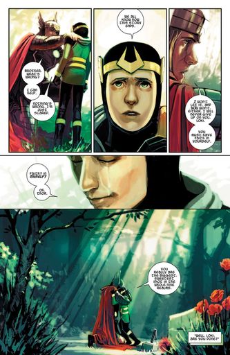
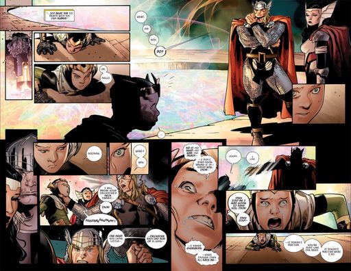
Been re-reading some of Kieron Gillen’s Journey into Mystery issues featuring his Loki reborn as a kid. Very Mask-ish “Reformed” stuff as L’il Loki – resurrected by and supported solely through his brother Thor – tries to overcome the collective mistrust of all of Asgard (and, well, everyone else), while trying to take to heart Thor’s dictum to do whatever it takes to do the right thing, with all the impulse control and ends-focused morality one might expect from Loki, esp. as he is advised by a magpie, Ikol, who is the consulting spirit of his previous life, is being called on to be a disavowed agent of the All-Mothers of Asgardia, and is accompanied by Leah, the handmaiden of Hela, and by a particularly vocal Hell-Hound.
It’s poignant, hysterical, gripping, and laden with doom (it is clear from the get-go that things will eventually, inevitably, end poorly for Li’l Loki, despite his best and most earnest efforts. He could, in fact, be playing the “Doomed” playbook).
At some point, aged to teen years (or a version of him who actually killed the young one, but feels really guilty about it), he is part of Kieron Gillen’s Young Avengers reboot, which is even more Masks-ish.
Something I always like seeing, so I figured I’d share. Here is a quick gif progression of all 33 layers that make up the picture here. Not quite a “how it’s made” but definitely interesting to watch as the various bits build up to make the final image.
Obviously things changed at certain steps so it doesn’t quite mesh up all the way, but that doesn’t matter for the final product.
Started working on something. Don’t know if the final result will be good, but I like my drawing of Harry from it so much that I decided I was at least going to color and share that part.
Given his background and family, I feel like Harry would have the best stories. Couldn’t say if he’d tell them well though. “Oh yeah, Atlantis is cool. I went there once with my mom. Mole men invaded. That part sucked.”
That looks really cool. And I know I’m behind the curve on this but I figured out a reason for Mercury to have the jacket. Because actually running with it and everything doesn’t really work. But when there isn’t fighting but a need to be in costume, he wants to cover up a little. Because “skin tight costumes wouldn’t really be my first choice but that’s what everyone else in the family wears and I guess it helps reduce some costume failures at super speed” but honestly no one really wants to be walking around in a skin tight outfit, especially not a teen. The self confidence to pull that look off is a rare blessing. And thus the jacket.
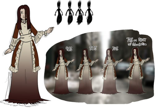
Man I feel like I’ve been negligent with some of these designs. I sort of put Ghost Girl in a corner and said, “This design is tough. I’ll figure it out later.” Well…
So here’s an iteration on Charlotte’s design and some design notes.
It probably needs an simplification pass, but I like it so far. Definitely sells the “from another time” look of the character, though not exactly the “ghost” part. Open to suggestions on that.
The dress is based on a vertiline gown that I found and loved the design of (you’ll probably find it right away too if you Google vertiline gown). Oddly enough, all that pillow-y fringe is actually oddly easy draw. It’s weird, draw it the way it’s actually put together and it looks wrong. Sketch some overlapping alternating convex/concave lines and attach them and it looks great. Art is magic sometimes.
So as much I loved the idea of a skirt made of smoke… I could never get it to look right. It was either overly complex and drew attention or it was just a shapeless blob and looked horrible. Instead, we’re going Morticia Addams here. That’s a maybe keep at this point. It looks okay, it’s easy to draw, and it fits the “undead” theme, but there might be a better idea out there still.
The next thing that I wanted to work but just… didn’t: transparency. Just never looks with complex shapes behind her for the same reason the the smoke dress didn’t. Also makes some odd tangents if there’s something behind her face. A nice compromise is the glow effect (last in the tests), but I think I’ll also wash out the black lines a little (probably the same color as her hair, but we’ll see) so she looks out of place. This is getting filled under “Still in Progress.”
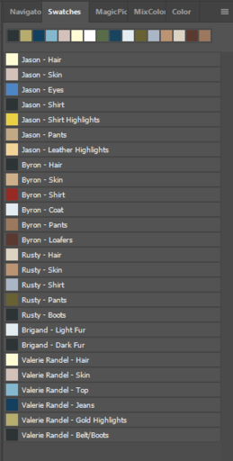
Finally, on a side note that affects all of the pictures I finally did myself a favor and made color pallets for all the characters. Basically it’s saving colors so that I don’t have to go back to another picture and hope the original, pre-shaded/pre-highlights color is still there. They’re super simple to put together and I usually make them if I’m going to draw the same character a lot, but they’re also time consuming (especially if you forget a color and have to re-order them) and I was thinking at the get-go “Oh, we’ll probably play this game for a couple of months like the DW game. I’ll draw like one picture and won’t even worry about how character designs work outside the one-off group picture.” Showed me, didn’t we?
For what it’s worth, I deeply respect the art you’ve been putting together here, and the work and organization and creativity behind it. Thank you, sir.
I love the dress! I think that there needs to be a slightly different transition from the skirt to the puddle on the floor. Would changing her skin tone a more grey/white make her look more ghostly or just look wrong?
Thanks Dave. I do this for me, but I do appreciate everyone’s appreciation for the work. It is fun for me, but it’s also a lot of hours that go into it.
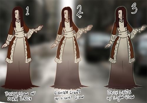
With that said, I made some changes to the glow/lines based on the previous ideas. #2 is my favorite but, as always, I’m open to suggestions.
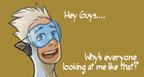
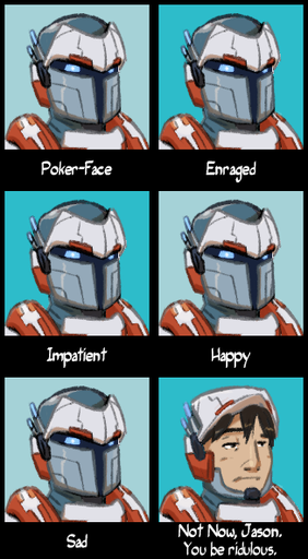
It’s been a silly Friday evening, so I decided to throw together some memes (to go along with the Concern Jason). If anyone has a suggestion for GG or Concord, I’m all ears.
This started out as just a silly picture of Mercury because silly pictures of Mercury and grew out from there.
 It’s poignant, hysterical, gripping, and laden with doom (it is clear from the get-go that things will eventually, inevitably, end poorly for Li’l Loki, despite his best and most earnest efforts. He could, in fact, be playing the “Doomed” playbook).
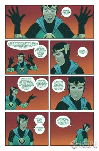
