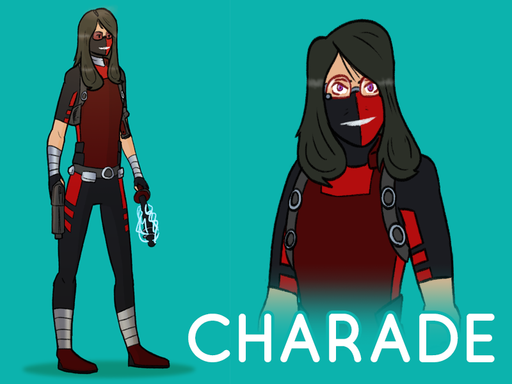
Alright, here’s what I was working on with Charade’s design. Using a lot more of the the Reformed’s design, but still very Alycia. Opinions?

author: Mike
url: Community Forums: Art Thread | Roll20: Online virtual tabletop
Alright, here’s what I was working on with Charade’s design. Using a lot more of the the Reformed’s design, but still very Alycia. Opinions?
author: Mike
url: Community Forums: Art Thread | Roll20: Online virtual tabletop
I’m liking this. I know a lot of the imagery I’ve thrown up on the Pinterest is more heavily / tactically armored, but a lighter touch with appropriate ballistic materials does the job better.
I’m thinking the ponytail approach might make more sense, both from a not-getting-hair-in-face and as a quick way to change her look.
I like the half-mask (for comfort’s sake). The face on the right looks kind of scary-hostile, which isn’t necessarily a bad thing, but there was a comedic element to the previous (half)smile you did that I liked, too.
(I’m also almost thinking mirror shades, though that might be a bit much.)
I really appreciate what you have here, though. Overall, it’s good stuff! (And it covers up her tattoos, which I haven’t detailed, but which do exist on her upper arm and chest.) Thanks!
I’m liking the idea of Alycia carrying an array of non-lethal weapons – escrima sticks, guns with gel bullets, flash-bang grenades, etc. AEGIS would not be happy about arming her with explicitly lethal weaponry, esp. if there’s a chance that some headline reading “KNOWN TERRORIST, ACTING AS AEGIS AGENT, KILLS THREE IN BLOODY SHOOT-OUT” might occur.
That said, she’d be likely to carry, if not hold-out weapons, backup clips with more punch for things like the proverbial Giant Yule Cat.
Sooner or later she’s going to rebuild her hypertech electricity glove(s), perhaps for use with metal escrima sticks (akin to the lightning rod shown above).
So, okay, let’s talk about the typeface for the CHARADE logo … ![]()
author: *** Dave H.
url: https://app.roll20.net/forum/permalink/6182518
*** Dave H. said:
I like the half-mask (for comfort’s sake). The face on the right looks kind of scary-hostile, which isn’t necessarily a bad thing, but there was a comedic element to the previous (half)smile you did that I liked, too.
This might just be me, but I cannot think of Alycia without a low-key aura of menace surrounding her. Even on the team and recent breakthroughs, it’s a bit like teaming up with early Wolverine–you’re glad to have them around when shit hits the fan, but no one’s inviting you to hang out after the battle. I can, however, work on that smile. Was the half smile part of what worked? Was it that it had more of a smirk quality to it? Was it that the eye with the smirk helped sell it? Do you think adding different styled lens to the glasses (ala Spider Jerusalem) would convey that same quality?
*** Dave H. said:
(I’m also almost thinking mirror shades, though that might be a bit much.)
This is totally a pragmatic reason on my end but without the mouth–due to it being covered by the mask and the perma-smile–her eyes and body language are the last bit of emotional conveyance I have and I’m not great at the body language part.
*** Dave H. said:
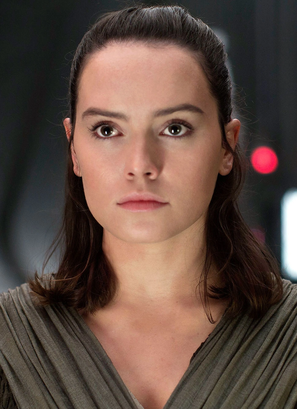
I’m thinking the ponytail approach might make more sense, both from a not-getting-hair-in-face and as a quick way to change her look.
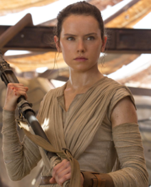
I just completely forgot about this one detail, so I’ll be sure to correct at some point. I’m just a little torn on which creates a better outline for the character: tightly bundled with no loose hair, or loosely tied back with the back unconstrained (or–as I like the differentiate them–Rey in Episode Seven or Rey in Episode Eight). I lean more to the tight bundle as, visuals wise, this conveys more of a stand-offish and practical look (which is what I associate with Alycia), as opposed to the other which is a softer, kinder look. However, that might show that Alycia is trying to open up. Choices.
*** Dave H. said:
So, okay, let’s talk about the typeface for the CHARADE logo …
I know you’re joking, but that font (Luna) was actually part of my Creative Market membership this week and I just really wanted to try it out on something after downloading it on Monday. Not the best use (at least it is sans serif and doesn’t clash with the lineart), but it works.
author: Mike
url: https://app.roll20.net/forum/permalink/6182712
Mike said:
This might just be me, but I cannot think of Alycia without a low-key aura of menace surrounding her. Even on the team and recent breakthroughs, it’s a bit like teaming up with early Wolverine–you’re glad to have them around when shit hits the fan, but no one’s inviting you to hang out after the battle. I can, however, work on that smile. Was the half smile part of what worked? Was it that it had more of a smirk quality to it? Was it that the eye with the smirk helped sell it? Do you think adding different styled lens to the glasses (ala Spider Jerusalem) would convey that same quality?
Completely fair comment on the “low-key aura of menace.” And that’s appropriate. (If still strangely difficult for me to do because I am such a no-menace person, and an 90% more like Jason than Alycia. But I digress.)
Yes, the smirk. There should be humor there, but dark, irksome, perhaps menacing humor. A smirk that says, “Hey, look, I’m shooting you, and it might even make me laugh.”
As I am so very not a Spider Jerusalem fan (despite my general fondness for things Warren Ellis), I can’t all countenance any such a thing.
This is totally a pragmatic reason on my end but without the mouth–due to it being covered by the mask and the perma-smile–her eyes and body language are the last bit of emotional conveyance I have and I’m not great at the body language part.
Perfectly legit. Riffing off the comics world, yeah, it’s always a compromise with what actually presents properly in the medium.
I just completely forgot about this one detail, so I’ll be sure to correct at some point. I’m just a little torn on which creates a better outline for the character: tightly bundled with no loose hair, or loosely tied back with the back unconstrained (or–as I like the differentiate them–Rey in Episode Seven or Rey in Episode Eight). I lean more to the tight bundle as, visuals wise, this conveys more of a stand-offish and practical look (which is what I associate with Alycia), as opposed to the other which is a softer, kinder look. However, that might show that Alycia is trying to open up. Choices.
Given those two pix, I’d definitely go for Ep 7.
I’m find with her coming across as stand-offish/practical.In the normal scheme of things, that opening up would happen over time. So I’ll hit you up again around Issue 35 for a complete redesign. ![]()
I know you’re joking, but that font (Luna) was actually part of my Creative Market membership this week and I just really wanted to try it out on something after downloading it on Monday. Not the best use (at least it is sans serif and doesn’t clash with the lineart), but it works.
I am joking in that Alycia way. ![]() I’m a huge (if amateurish) font wonk, so it’s probably best if I back off and not dive down that rabbit hole with my rocket boots on. Carry on.
I’m a huge (if amateurish) font wonk, so it’s probably best if I back off and not dive down that rabbit hole with my rocket boots on. Carry on.
author: *** Dave H.
url: https://app.roll20.net/forum/permalink/6182750
*** Dave H. said:
Completely fair comment on the “low-key aura of menace.” And that’s appropriate. (If still strangely difficult for me to do because I am such a no-menace person, and an 90% more like Jason than Alycia. But I digress.)
Yes, the smirk. There should be humor there, but dark, irksome, perhaps menacing humor. A smirk that says, “Hey, look, I’m shooting you, and it might even make me laugh.”
I’ll keep that in mind for future images.
*** Dave H. said:
(despite my general fondness for things Warren Ellis)
*** Dave H. said:
I am joking in that Alycia way.
I’m a huge (if amateurish) font wonk, so it’s probably best if I back off and not dive down that rabbit hole with my rocket boots on. Carry on.
Hehehe… I’ll just sit here with my massive library of fonts and smile.
author: Mike
url: Community Forums: Art Thread | Roll20: Online virtual tabletop
author: *** Dave H.
url: https://app.roll20.net/forum/permalink/6182910
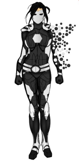
And just to add in another image, I’ll raise the “Alycia as Super-Hero” alternate universe persona that Doyce dug up.
Way to clean and glossy for this world’s Alycia, but it has something to say with hair and mask.
(Note to self: whatever happened to Alycia’s shirt-of-many-nanobots …?)
author: *** Dave H.
url: https://app.roll20.net/forum/permalink/6183187
So just to reinforce my tendency to not pick up on things quickly, I was doing some stuff on the Alycia wiki page, and that made me think about the photo that Bill originally dug up for her which I’ve come to deeply identify with the character …
… and realized I’d never gone out to look for the source for it.
Turns out it’s by a person with the handle chmartx, who had a deviantart account that originally had this image apparently, but that’s now closed down and she runs a Tumblr instead, which, like all things Tumblr, sucks for searching but I finally found it.
Now what I hadn’t realized (or if Bill mentioned it at the time I did’t remember; either is likely) is that this was a drawing of Asami Sato, from Korra (with the partial explanation for my non-realization being that this is not how Asami usually dresses).
That let me to look for other Asami images …
… (which I found several of and threw into the Alycia Pinterest, in case Mike finds them at all useful, with a reminder to me that she needs to fix up / recover her hypertech glove(s), which reminds me to ask Doyce why he very consciously made the decision that she didn’t have them in the Keynome Chamber under Federal City) …
… which dragged me down the korrasami ship rabbit hole, and so on and so forth.
But, anyway, belated thanks to Bill for digging up that picture in the first place (and to @chmartx for drawing it in the first place).
author: *** Dave H.
url: https://app.roll20.net/forum/permalink/6187774
Was that me? I don’t recall finding that picture.
author: Bill G.
url: https://app.roll20.net/forum/permalink/6187783
Hmm, maybe I assumed because you uploaded it to the wiki. But, then, it’s the wiki and you’ve done 90% of the work there, so I maybe assumed wrongly.
It wasn’t me, though. Which makes me think (and this would be a natural fit, given the source material) Doyce.
author: *** Dave H.
url: https://app.roll20.net/forum/permalink/6187859
It was Doyce. I’ve talked to him a couple times about the picture for illustrations I’ve done for the game.
author: Mike
url: https://app.roll20.net/forum/permalink/6187885
Thanks, Doyce! The picture was memorable, even if the original poster of it here was not!
author: *** Dave H.
url: https://app.roll20.net/forum/permalink/6188016
I was me, and I think I even mentioned after its introduction that it was from a Korra Modern AU art series I’d stumbled over.
She ditched the glove before following her dad’s instructions for getting captured and incarcerated by Byron Quill. It’s stashed in the city somewhere, or with someone, or something of that nature. Alycia hasn’t had time (or freedom) to recover the thing.
author: Doyce T.
url: https://app.roll20.net/forum/permalink/6188062
Thankee.
author: *** Dave H.
url: Community Forums: Art Thread | Roll20: Online virtual tabletop
Mike said:
Alright, here’s what I was working on with Charade’s design. Using a lot more of the the Reformed’s design, but still very Alycia. Opinions?
SO often, when I’m reading a comic I love, someone on the team will change and the book just isn’t as enjoyable for me. You’d THINK that if I were in it for the story, switching art wouldn’t matter, or vice-verse.
This is a long way to say “damn Mike I love having your art of this game - it informs so much of my thinking.”
So… thanks. ![]()
author: Doyce T.
url: Community Forums: Art Thread | Roll20: Online virtual tabletop
Hear-hear!
author: *** Dave H.
url: https://app.roll20.net/forum/permalink/6198025
Doyce T. said:
This is a long way to say “damn Mike I love having your art of this game - it informs so much of my thinking.”
So… thanks.
*** Dave H. said:
Hear-hear!
author: Mike
url: https://app.roll20.net/forum/permalink/6198327
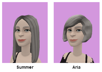
So as I mentioned over at the Valediction thread, I did up a couple of quick Plotagon characters for Aria and Summer. I based it on the image on the Wiki …
… though of course I was constrained, a bit, by the costume pieces available. That said …
It’s kind of easy to cheat a bit with the two of them, of course, since certain attributes are a matter of just copying over. It’s the most fun figuring out where they differ (Alycia’s snark notwithstanding).
They’re only in one quick shot in the video, but I had fun with them.
author: *** Dave H.
url: https://app.roll20.net/forum/permalink/6198607
author: Bill G.
url: Community Forums: Art Thread | Roll20: Online virtual tabletop
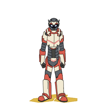
Went and thought through how I’d like to do character based images for the wiki and the results are… well they are good but there’s some limitations.
(Admittedly, a bit of this was an excuse to draw Link because I feel like I’m getting better at illustrating the illusion of complexity needed for simplistic power armor designs. Not great mind you, just better.)
I kept the aesthetic of the simplistic drawings I was doing earlier, with the same fixed-width pen and lack of shade, though I have added some shading to the lines*. This increase in detail comes with more time investment: the simple drawings took about 15-30 minutes**, these take about an hour/hour-and-a-half***. This means less “six done over a boring evening at home” to “two or three over the weekend with maybe a couple throughout the week.” Considering I had no schedule before hand means that I’ll probably never make it through the whole cast list****. But that could have been true regardless.
So with this in mind, I think my plan going forward is less “draw whoever I feel like or who the Random button on the wiki tells me to draw”****** and more focusing on the core cast, then the supporting cast, and finally the extras (and whatever other one and done characters have shown up). But who is that? Well, here’s how I break that particular set of characters down:
Main Cast (15)
Supporting Cast (22)
Extras (19)
One-Offs (19)**********
* To lighten up the design in this case.
** Depending on the character. Telekinetian took longer due to having to design him from scratch. The Monkey with the Hat took about 10 because I just drew what amused me and didn’t redo much because its a cartoon monkey in a funny hat***********.
*** That might just be the increased complexity of Link’s design.
**** Of which I was at 16% completed*****.
***** At the time of this writing. Watch April roll around and that get pushed down to like 10ish. ![]()
****** Though I still likely will, just because I need a break occasionally and they are fun for figuring out designs and playing around with characters.
******* Yeah, I’m counting civilian and hero identities separately, where needed.
******** Such as this. A living Charlotte Palmer is mostly just a pallet swap of Ghost Girl. Same for the holograms.
********* For now.
********** So far. I also left out anyone who hasn’t had a speaking line or got thrown into someone else************.
*********** Bowlers are inherently amusing.
************ That is really the way you determine if anyone is important in a superhero comic, after all.
************* The is no footnote 13, I just like footnote gags.
author: Mike
url: Community Forums: Art Thread | Roll20: Online virtual tabletop

