Bill G. said:
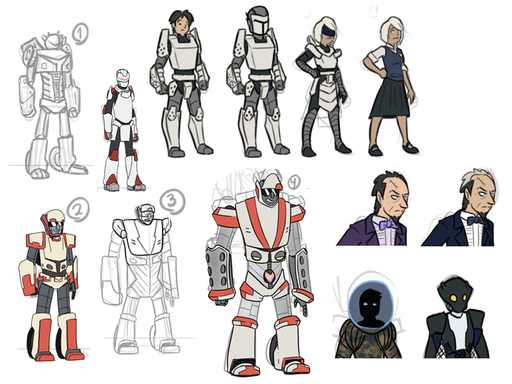
Top row, 3 and 4 (Link Suit, without/with helmet):
- an interesting cross of knightly and military feels. A boxy, masculine look.
- In particular, the slope of the chest has that kind of tank-armor vibe going on. Real sloped armor would basically be sending rounds down to his legs and crotch this way, but this is comic books.

I started thinking about Leo’s designs and came to the conclusion that this is a guy who prefers function over design. While a Nautilus or a Plasma Prince has financial backing for their designs, Leo has to scrimp and make due with that he has. Does that fit with the modular setup that his tech has? Not really, but it certainly visually conveys “these are simple designs from someone who is still coming into their genius.” And then the Newmans’ designs blow that out of the water. 
Bill G. said:
Bottom row, item #2:
- Feels like a scaled-up version of the Link Suit itself, including color scheme.
- He also has the gmail icon as a belt buckle? Sorry, couldn’t help it
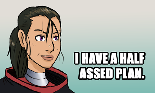
- It’s such a tiny detail, but the cheek definition gives him the impression of age and maturity compared to #4
I really do want someone to look at Otto, Link, and Pneuma and think “okay, these were all designed by the same person,” thus the shared elements. This was before I designed the top row though, so I didn’t work out a similarly designed Otto unfortunately. However, hearing that age and maturity part (while not intentional with that choice) certainly is something I think is important to Otto’s design, so I think I’ll keep that in later iterations.
As for the gmail icon (ugh, now I can’t unsee it) and the circular design on (4), I wanted something to visually represent the intention sync thingy that I’m failing on remembering the name of at the moment (I keep wanting to say heart drive, but that’s probably because the heart factory has been so prominent lately). Necessary? No, but in a comic it would be a nice visual signifier for when Link and the Newmans are on the same page (also, Link and the Newmans sounds like both the Saturday morning cartoon series of those kids’ adventures and some mid-week broadcast network sitcom).
Bill G. said:
Bottom row, items #3 and #4:
Very intentional proportions here. Otto’s the big guy of the Newmans, so I wanted that to carry over in the design more than just with the height. (As a bonus, here’s Kasia Slupecka talking about a similar design concept as it pertains to Street Fighter characters–I love the weird tangents you can get into when talking about art, from comic books to fighting games. :P)
Not going to lie, I love Big O’s more than a little bit and his design really sells the look of a boxer. Given that that’s Link’s go to fighting style and the Megadeuce’s chains remind me of the skyhook system, it seemed like a good parallel to make. Just need to make it look less “Big O shields” and more “V-8 engine block” to fit the car aesthetic.
Bill G. said:
- I can’t get away from that headlights-as-nipples thing.
Well, we’re getting rid of those. Did not even think of that.
Bill G. said:
- The sunglasses and grin are fucking spot on personality-wise.
But of course.
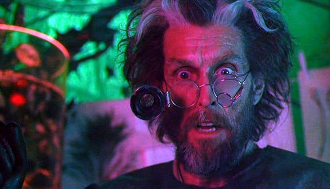
Bill G. said:
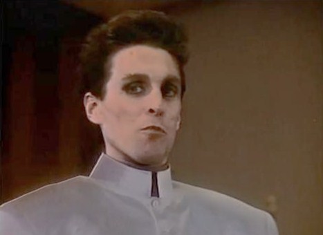
Balding Rossum:
- the nose continues to be on point (ha ha).
- Walter/Walternate definitely both have a full head of hair, to say nothing of Dr. Tenma, but this is good too.
- It looks a lot like the original Professor Moriarty by Sidney Paget: https://en.wikipedia.org/wiki/Professor_Moriarty#/…
The balding aspect, in hindsight, is some very generic mad scientist design tropes and generic is something I should be avoiding. I might do something closer to Walter/Walernate’s hair style in future images (Doyce, if you want something specific for tomorrow’s game, you know where the suggestion box is) but this was mostly just a “can I get something that feels right for the character.” Further iterations will definately be needed.
author: Mike
url: Community Forums: Art Thread | Roll20: Online virtual tabletop